stusnag
a prospective mobile app where students within a university campus can snag and give away groceries!
the app is aimed at college students who want to practice sustainability, maximize a tight budget, and foster campus community!
for this was a school project, we were given the prompt by the professor, which was to create a cooking/recipe app. however, it was in our hands to hone in on a specific avenue, and our guiding problem ended up being “how can we come up with a solution to the reality of tight student budgets and inevitable food waste when groceries aren’t able to be used in time?”. however, it is important to note that when we initially began this journey, we were pursuing to create a standard recipe application, but sometime in the middle of the research process, we felt compelled to shift.
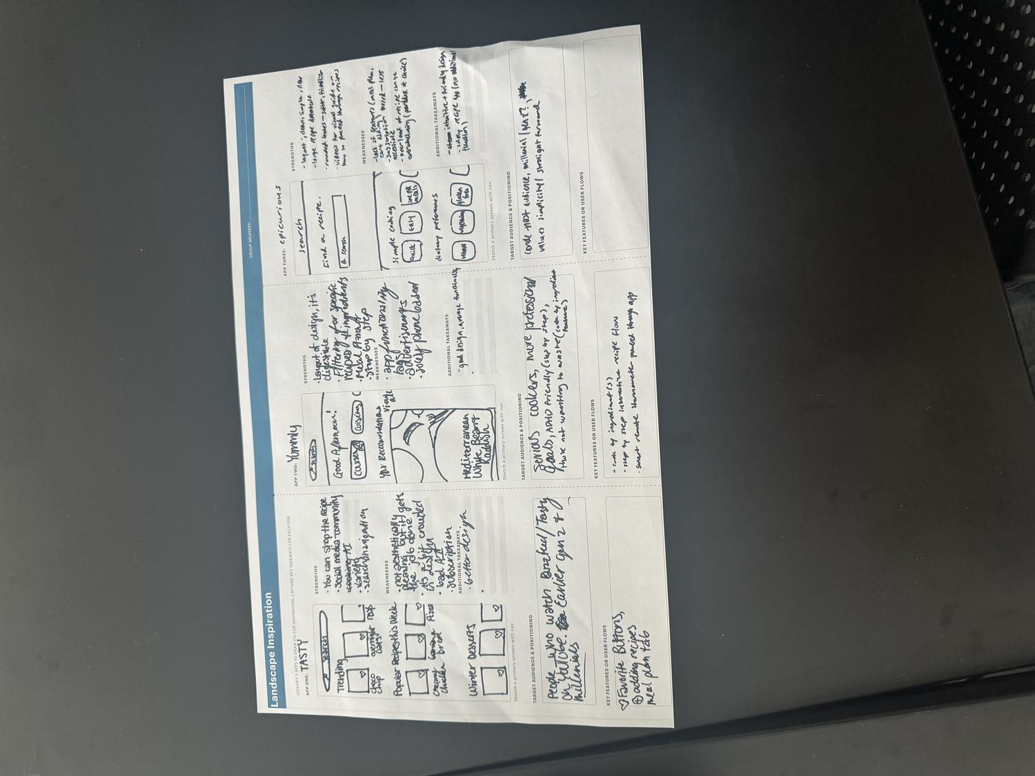
to kickstart the research, my collaborator and i looked at competing apps within this market and noted each one’s strengths/weaknesses, target audiences, and key features/user flows alonside some additional takeaways. all the apps seemed to follow a consistent set of features, such as searching, categories, and saving capabilities, as well as similar information architecture, with the searching feature residing at the top of the screen, and a nav bar at the bottom.

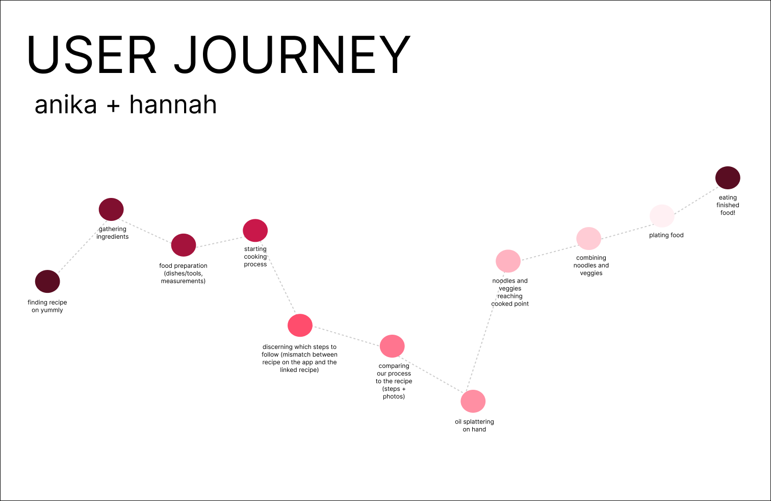
we then placed ourselves in the consumers’ shoes, using the app YUMMLY as our recipe guide and following one of the recipes within the app. we mapped out the flow of our emotions/experience throughout the process, and we in particular felt frustration when trying to navigate the recipe due to the actual recipe (on a separate blog post) listing different ingredients than the app.
to kickstart the research, my collaborator and i looked at competing apps within this market and noted each one’s strengths/weaknesses, target audiences, and key features/user flows alonside some additional takeaways. all the apps seemed to follow a consistent set of features, such as searching, categories, and saving capabilities, as well as similar information architecture, with the searching feature residing at the top of the screen, and a nav bar at the bottom.
persona
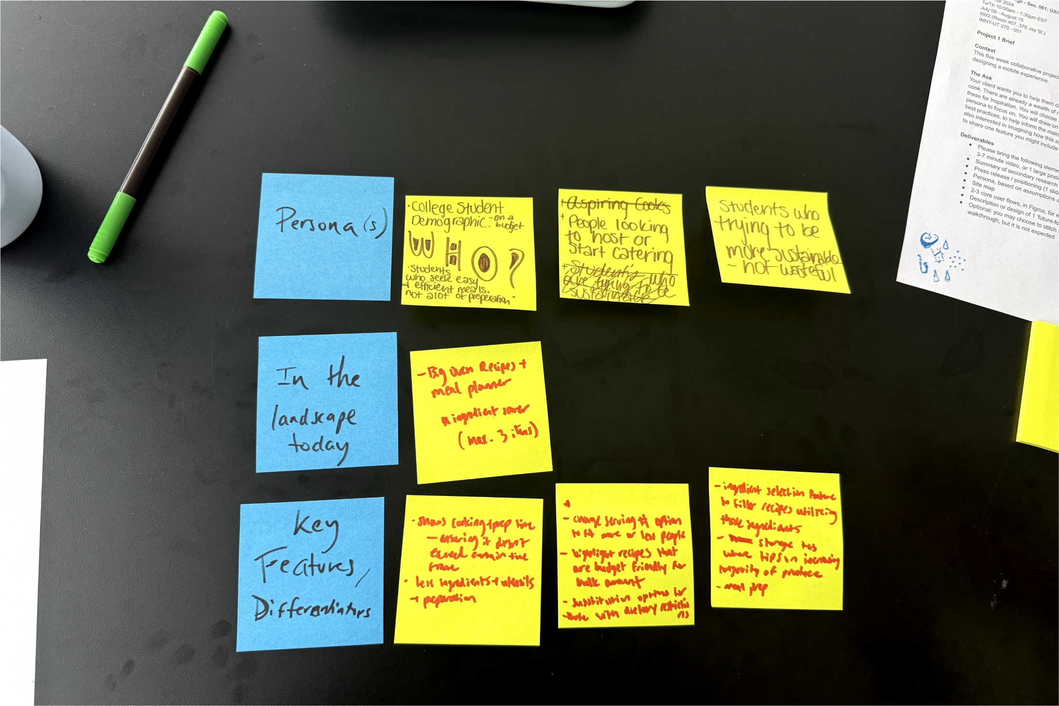
taking from the ideation, we decided to look inwardly at ourselves since we were both members of the demographic we were trying to target. we both found that we often had frustrations related to waste, lack of motivation to cook, and unhealthy eating habits due to the chaos of student life. we decided to encapsulate a version of both of us into a persona, and we landed on naming our person gojo (jjk fans you know what’s up ;p), and making their background reflect not just ourselves, but college students as a whole.
taking from the research we conducted alongside our persona, we thought about what components we wanted in our app alongside the architecture. we followed the general layout many cooking recipes had in terms of chronological categorization, but we centered our swap feature since it was the core feature of our app.
need 1
need 2
need 3
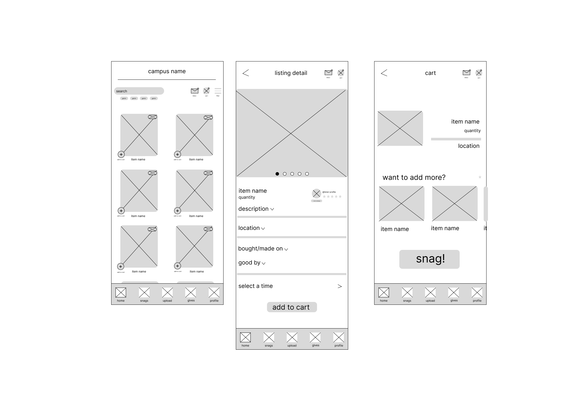
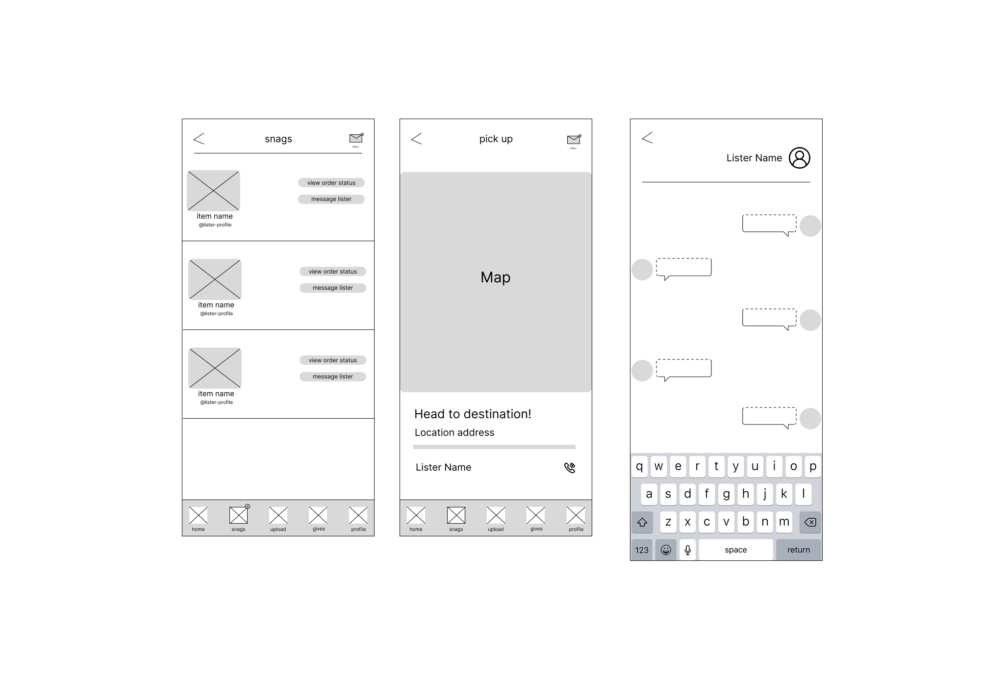
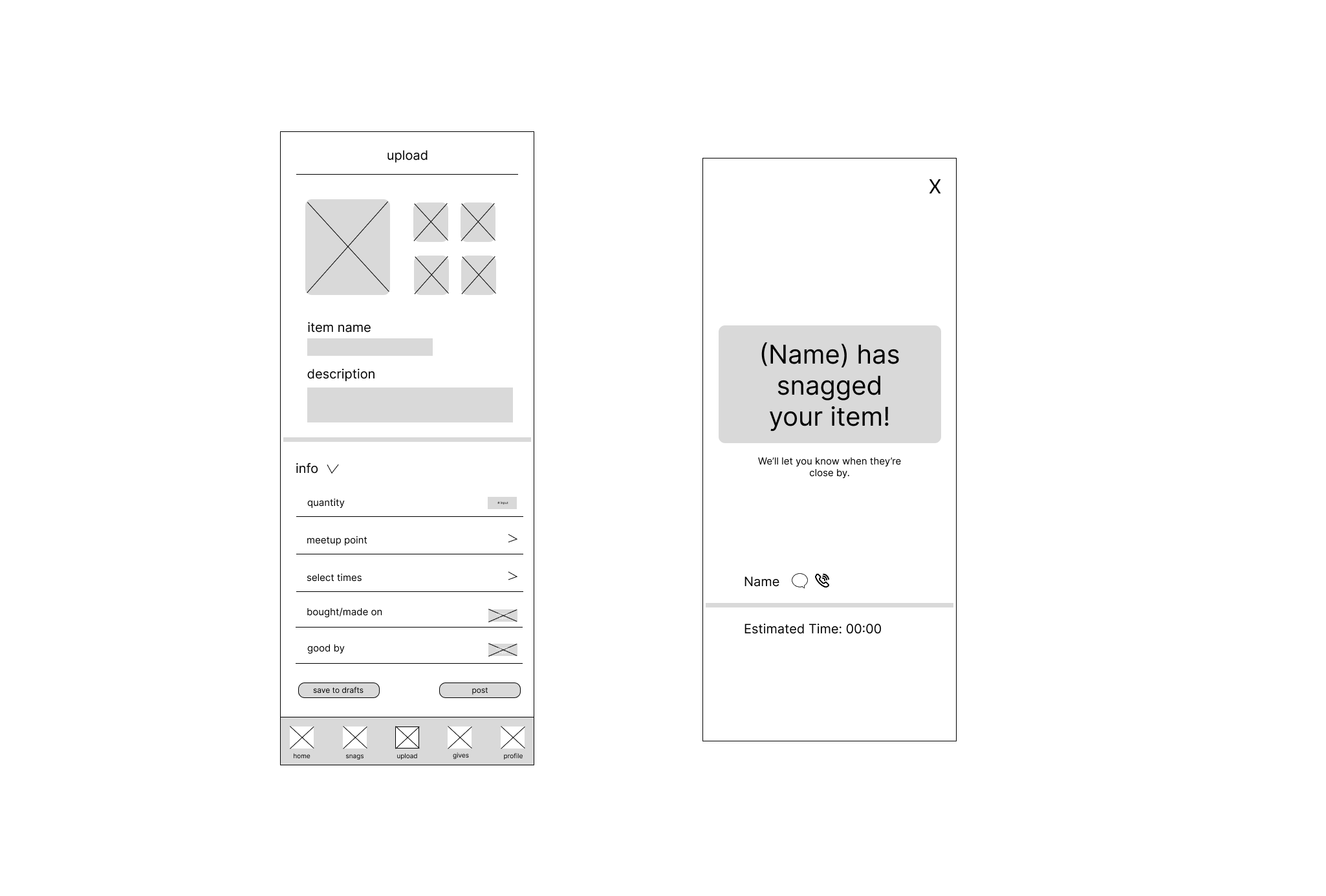
taking from our previous research, we created a few wireframes (home, snags, upload, notification) to help us visualize the app's layout and flow. our main goal was to get the core interaction and structure, before committing to details and the final design.
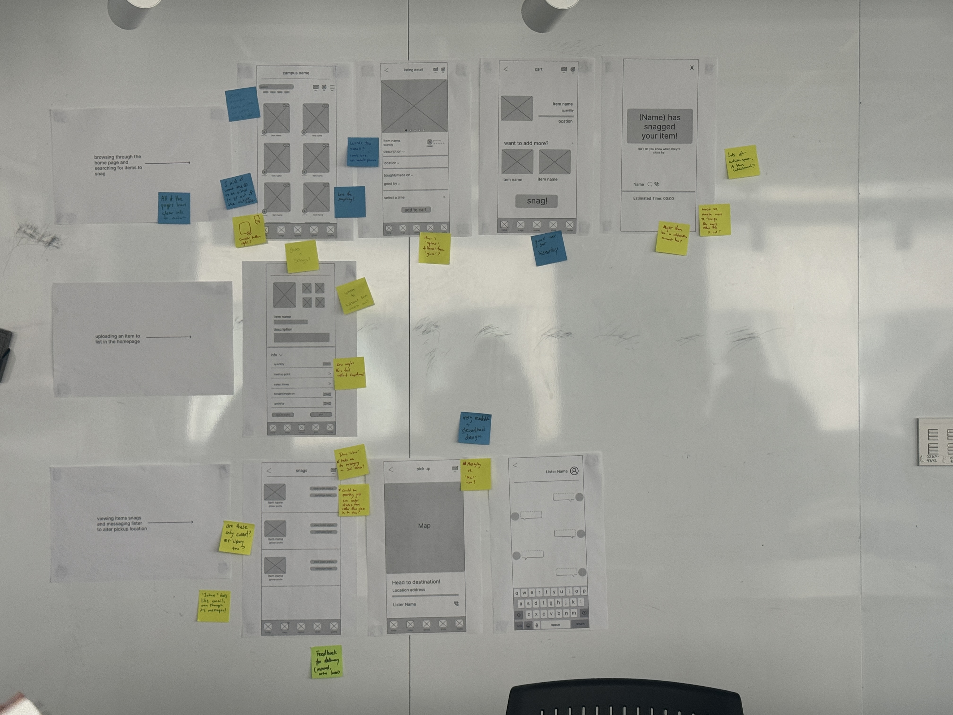
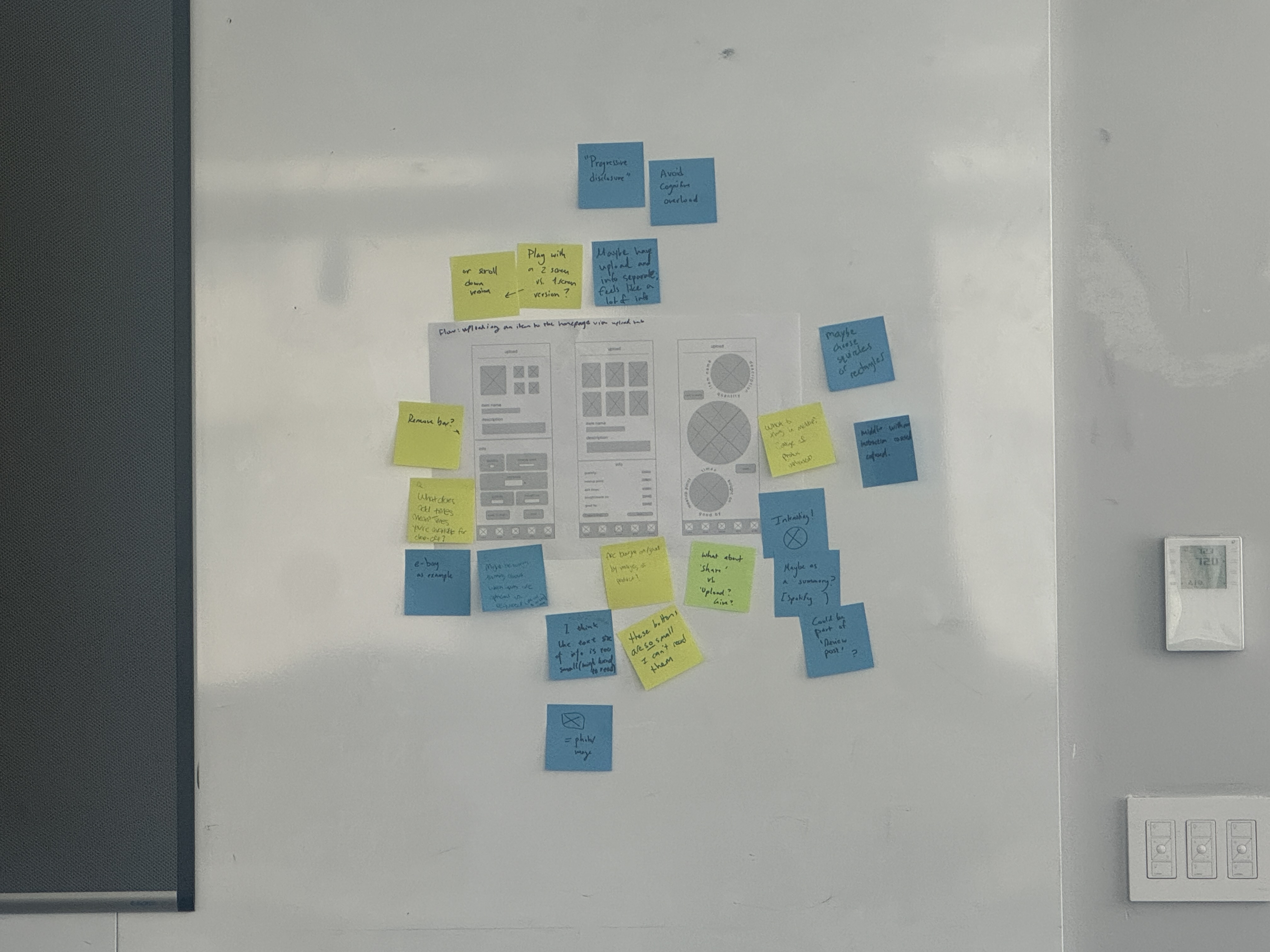
we then asked our peers to give us feedback on our wireframes, and received lots of great pointers in making our app more intuitive. we also ideated a "wild card" layout for the upload page as an exercise for brainstorming, but we also ended up learning a lot from it!
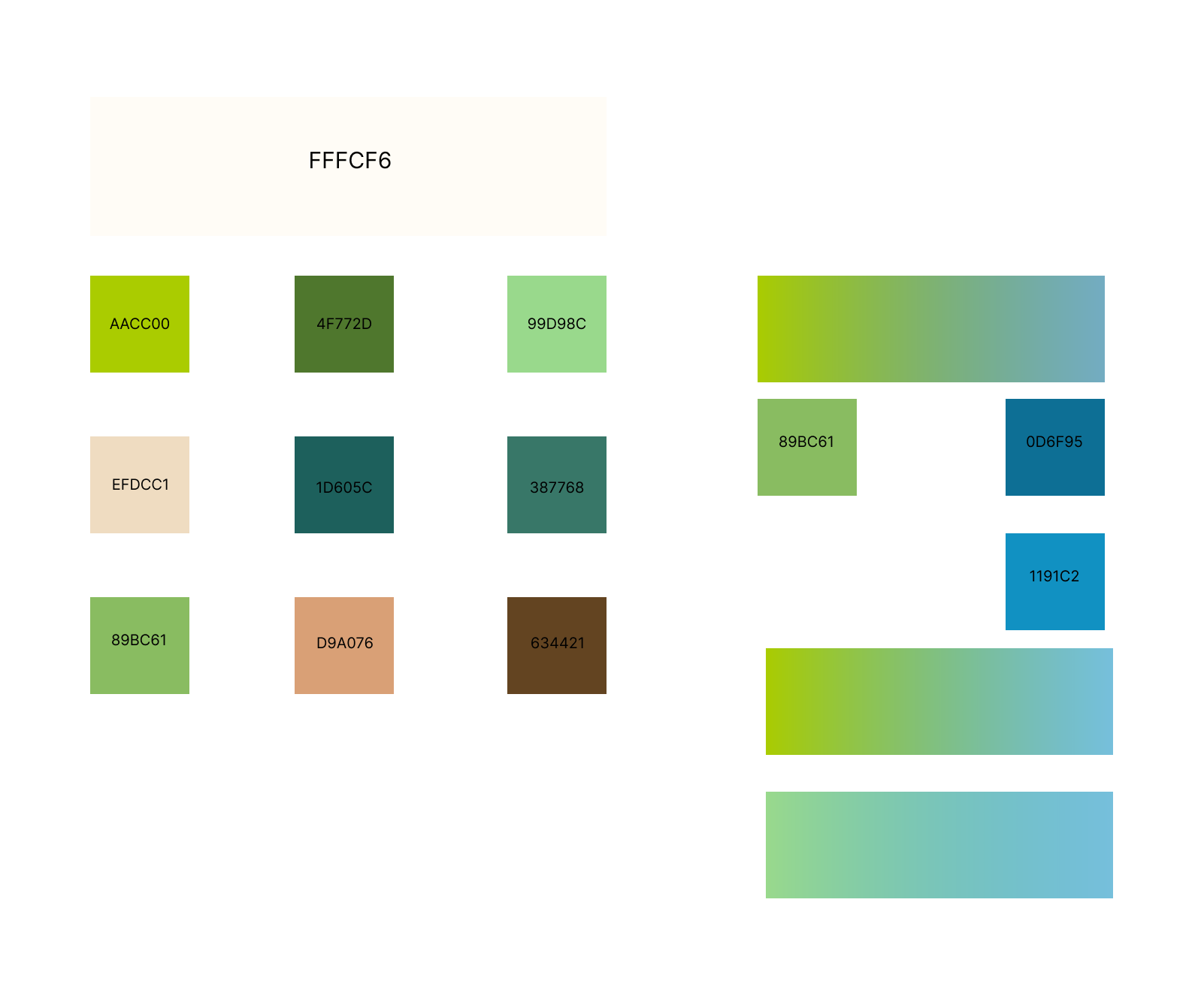
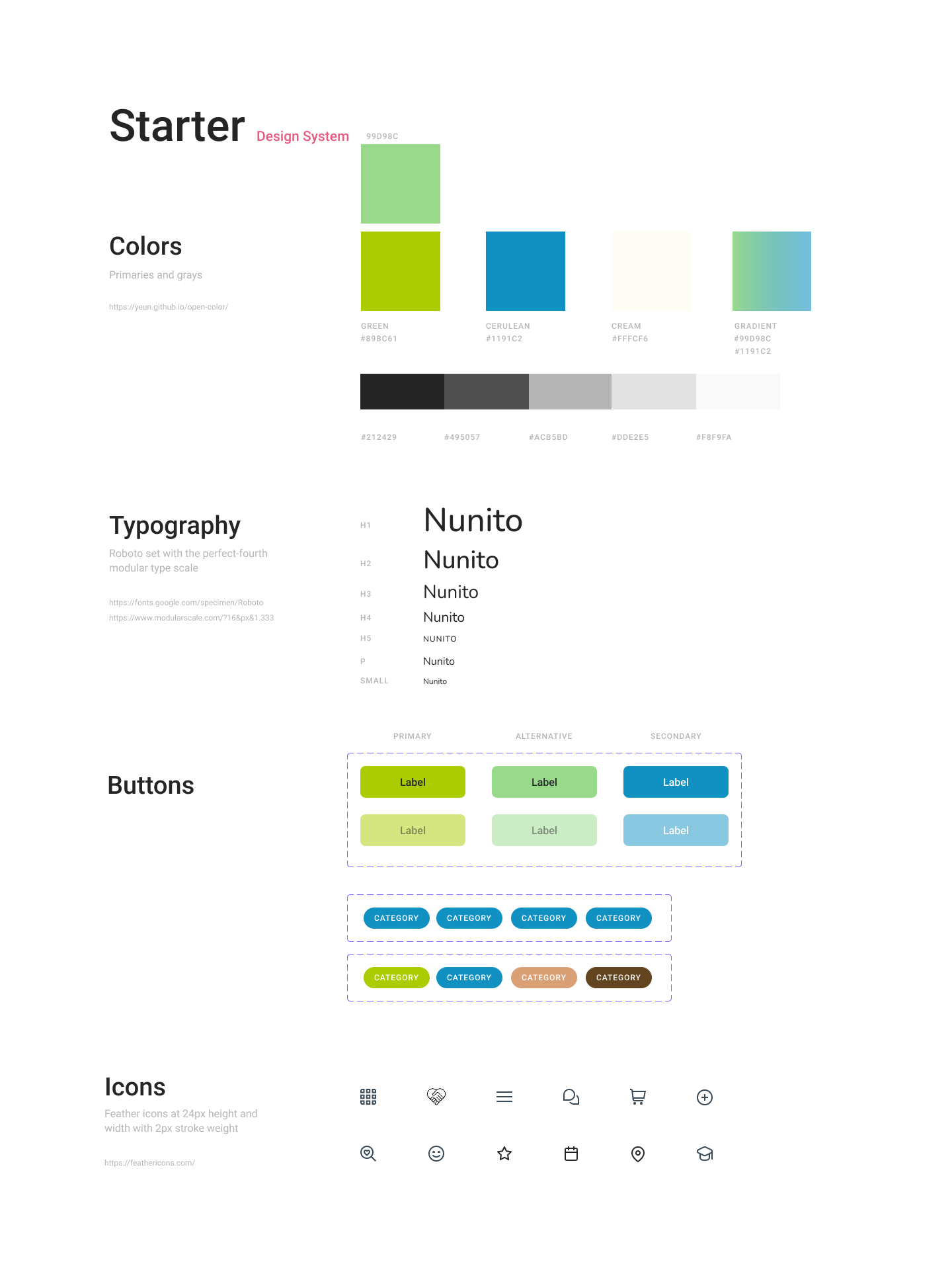
when designing the system, we first thought about the colors as a way to shape the app's visual identity. seeing how our app was centered around the idea of sustainability, we decided to work with colors that paid homage to the natural world, but also maintained a modern touch. we then thought about the typography, and we decided to use a sans-serif font to keep the app clean and modern. Nunito in particular offered this feel but also had a friendly, approachable vibe that we thought would be great for our app.
iteration 1
using the design system, we created a first iteration of the app in all of its visual glory. however, it did not meet our vision exactly, and with some feedback from peers, we decided to reiterate.
iteration 2
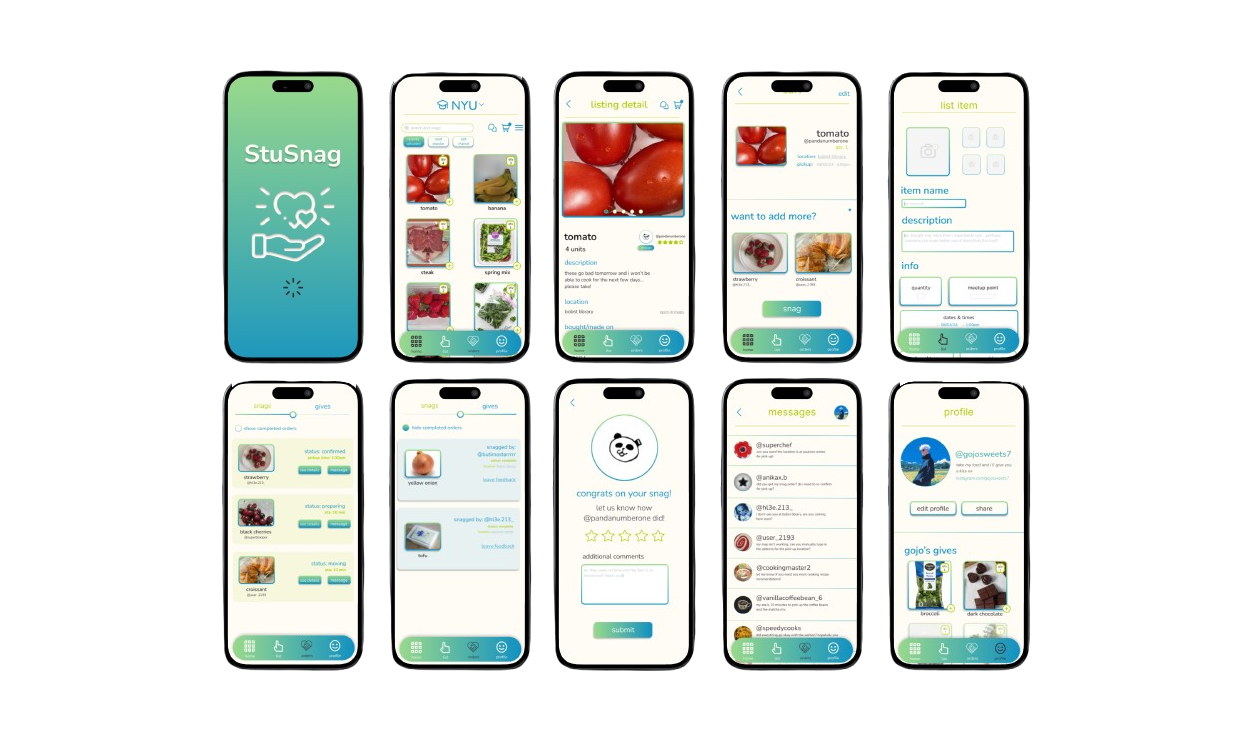
we landed on this iteration as our final, and then prototyped all the transitions to replicate a physical experience with the app!
coming soon....